


Recognisably Barclays
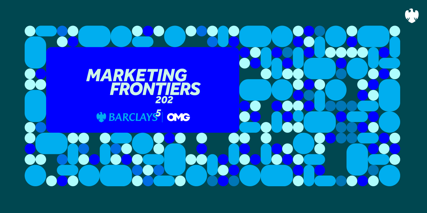
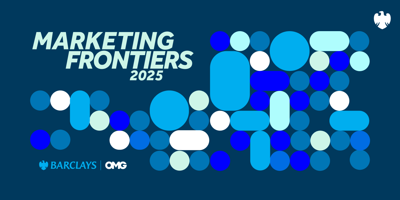
Built only from the brand’s cyan and navy, and its typeface, Effra.
Introduction
Barclays’ annual marketing conference. Two days. One venue. 500 industry professionals.
The brief
The event is the only time in the year all Barclays’ marketing teams, external partners and agencies are in one place at the same time. It needs its own identity that respects the main brand, encourages experimentation, and supports the event theme.
Built only from the brand’s cyan and navy, and its typeface, Effra.
One motif that holds at 20mm on a lanyard and across a full wall.
Planned around how delegates move through the venue, not around a logo.
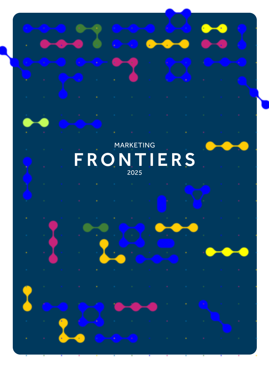
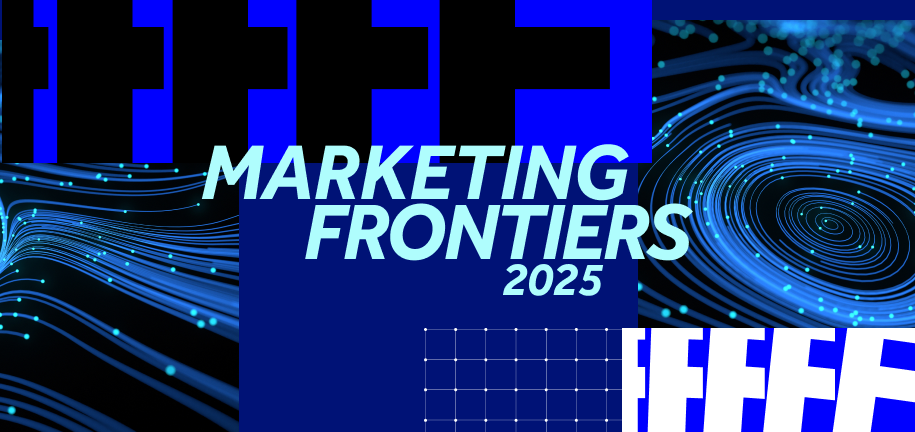
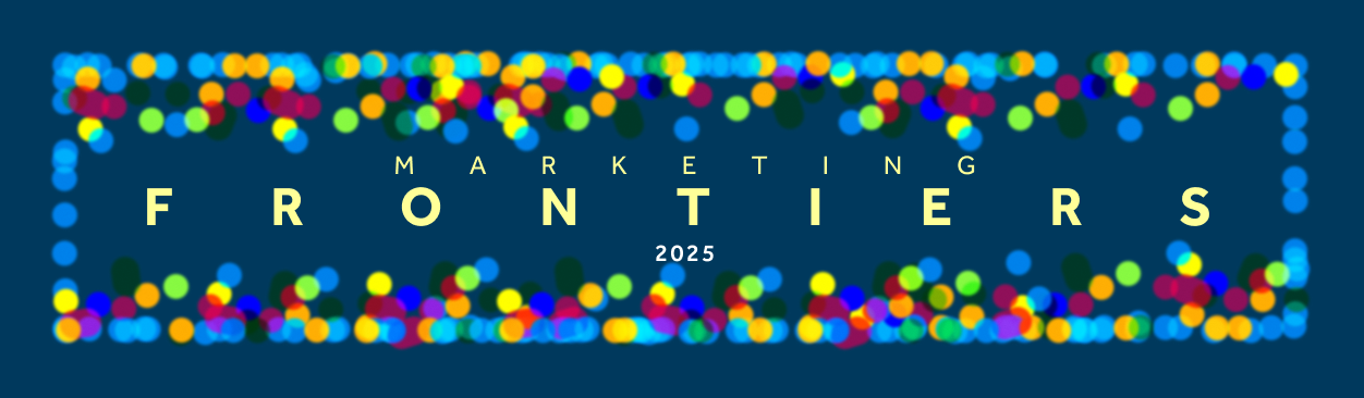
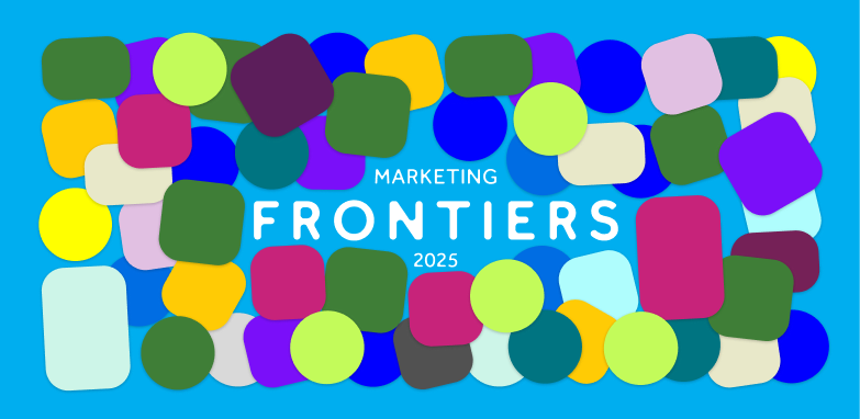
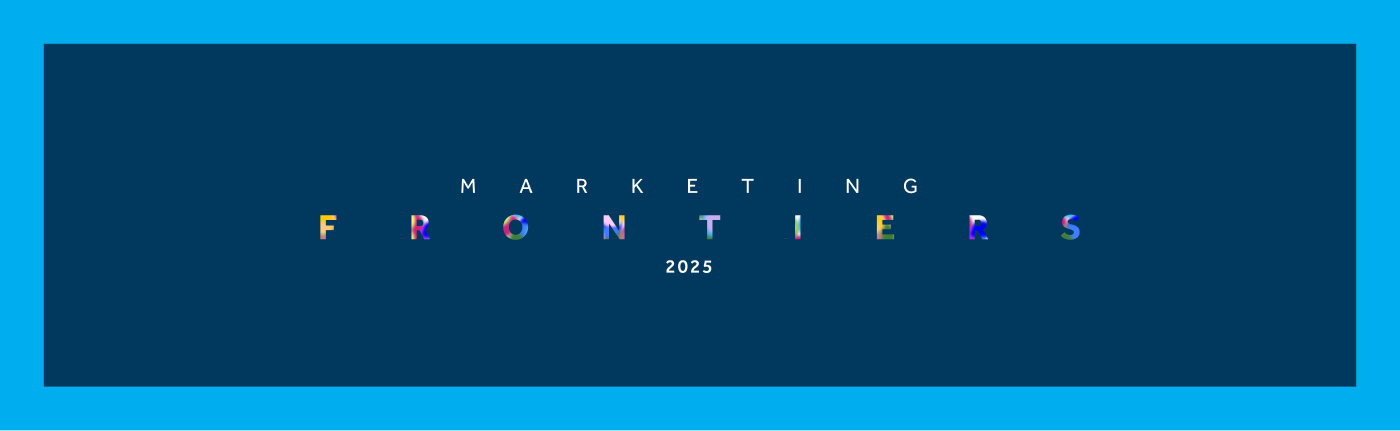
Early ideas and exploration11 routes
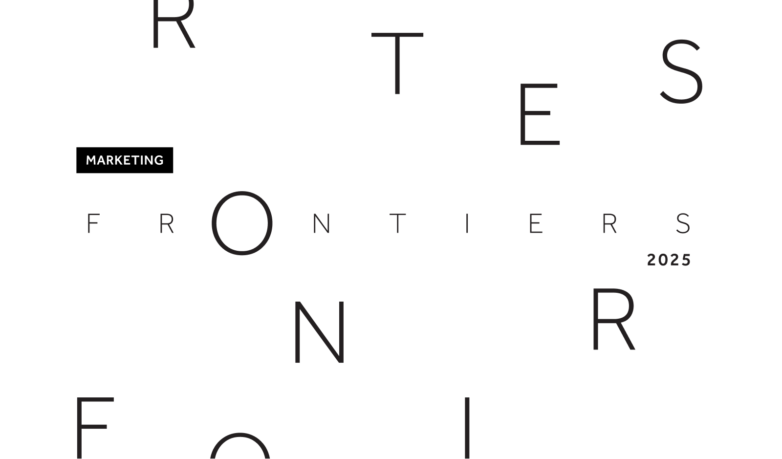
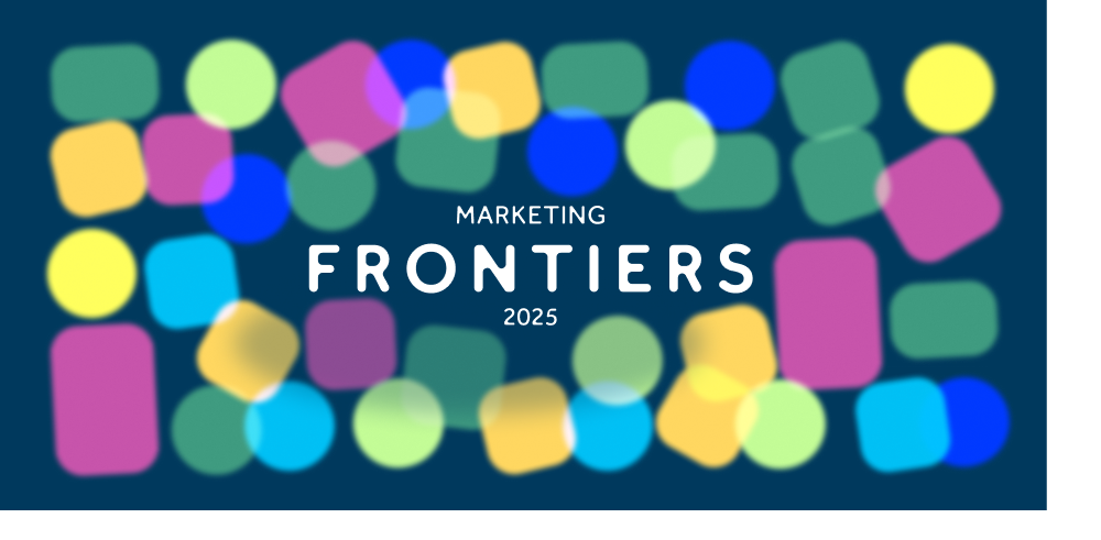
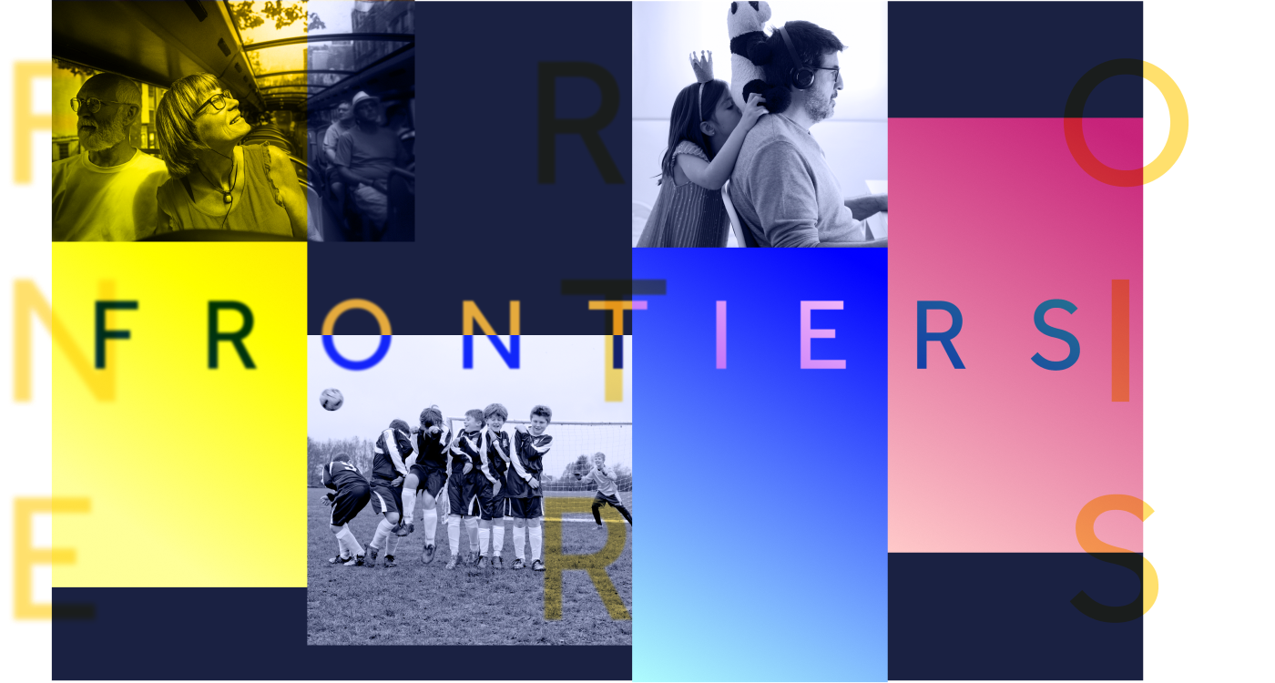
02The idea
It starts with
one dot.
Multiply it.
A crowd.
A data field.
A city at night.
A community
made of light.
1 dot
Colour
Constraint is the system. Navy holds the room, cyan carries the light, and opacity does the rest: overlapping dots build every tint in between without a single extra colour.
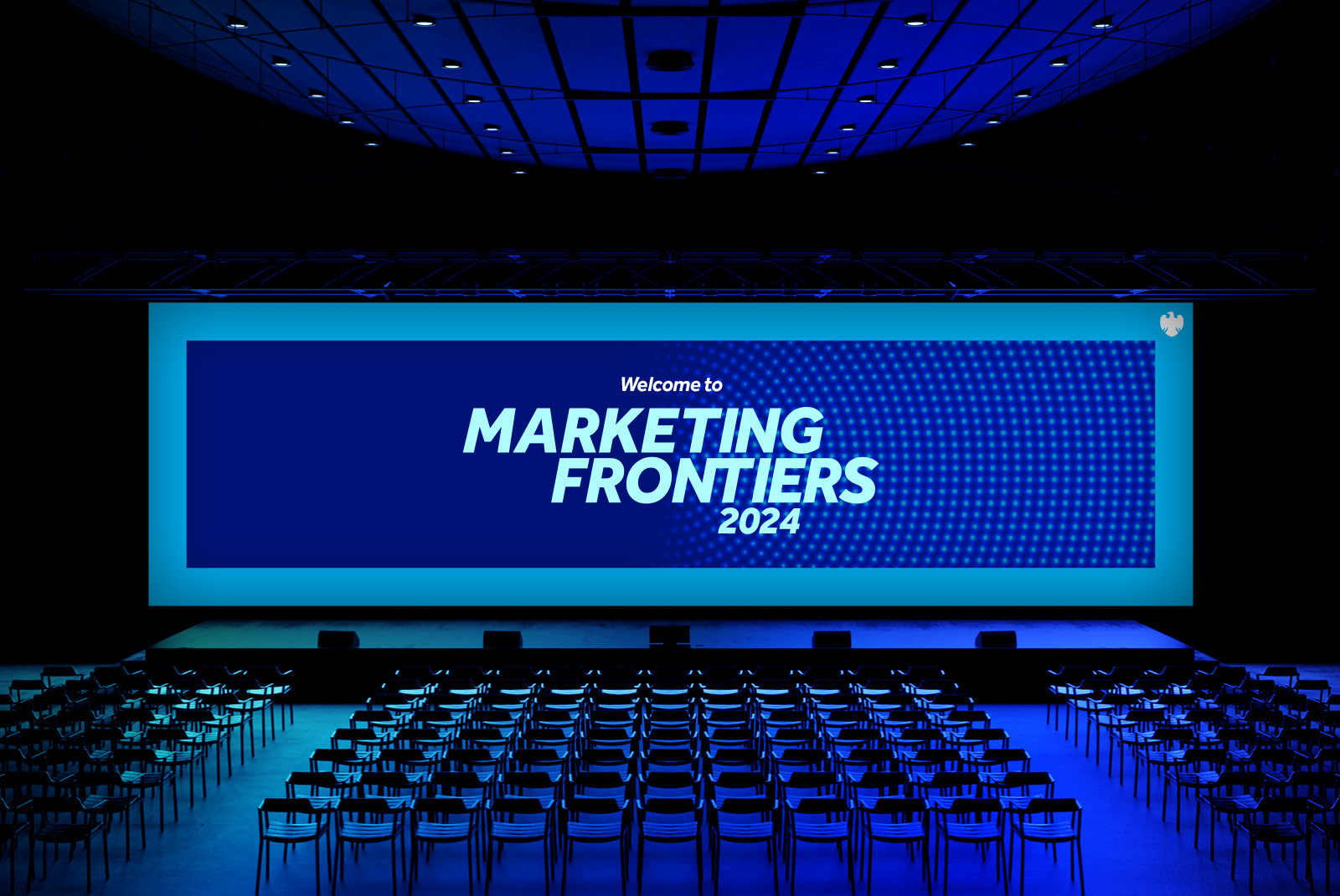
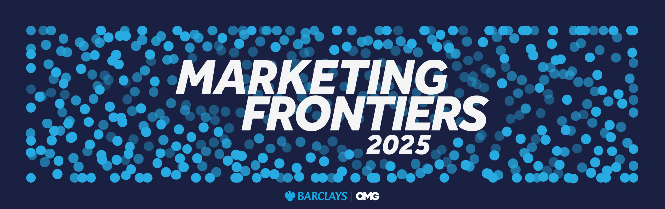
Main stageUltra-wide holding loop — 3840 × 1080

04Motion
On screen the field drifts, gathers and parts to reveal content. One behaviour, re-timed for each moment.
In the space
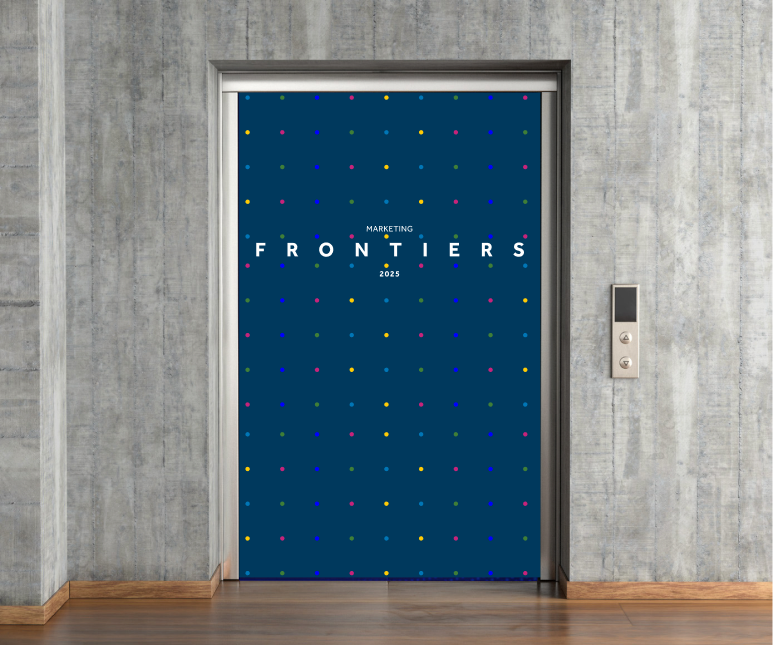
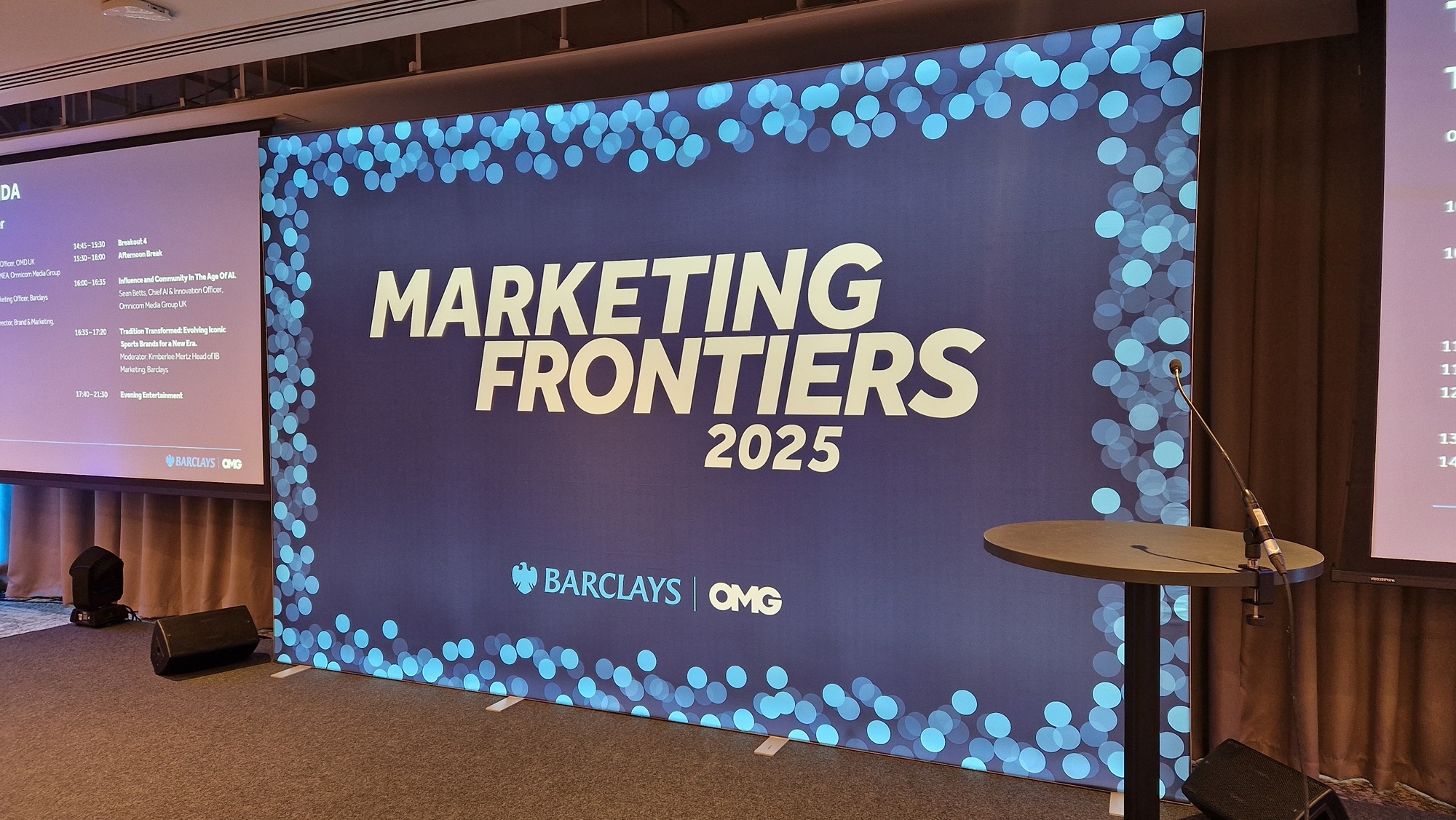
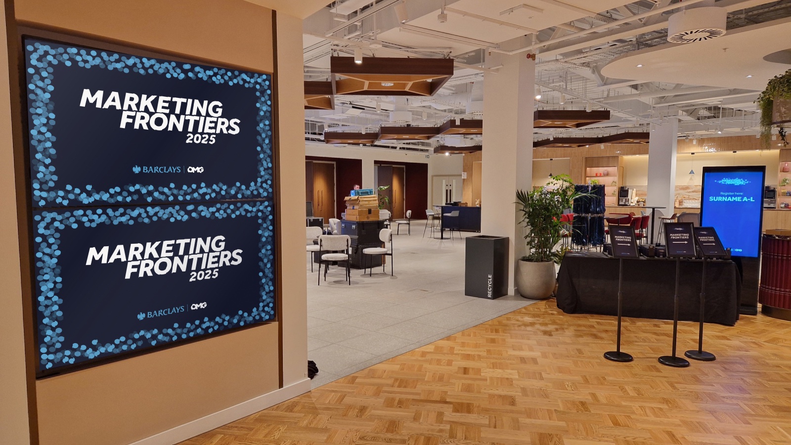
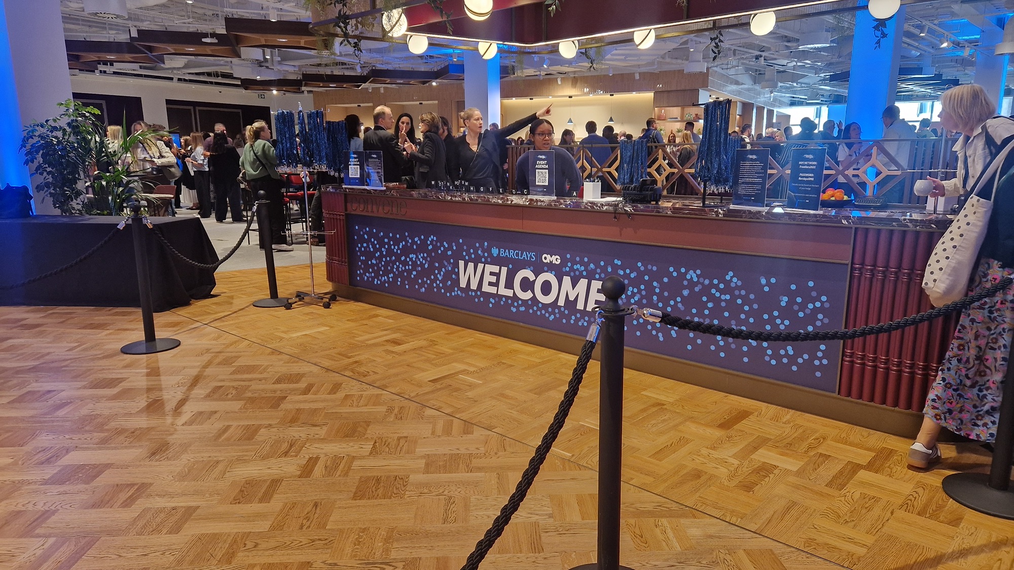
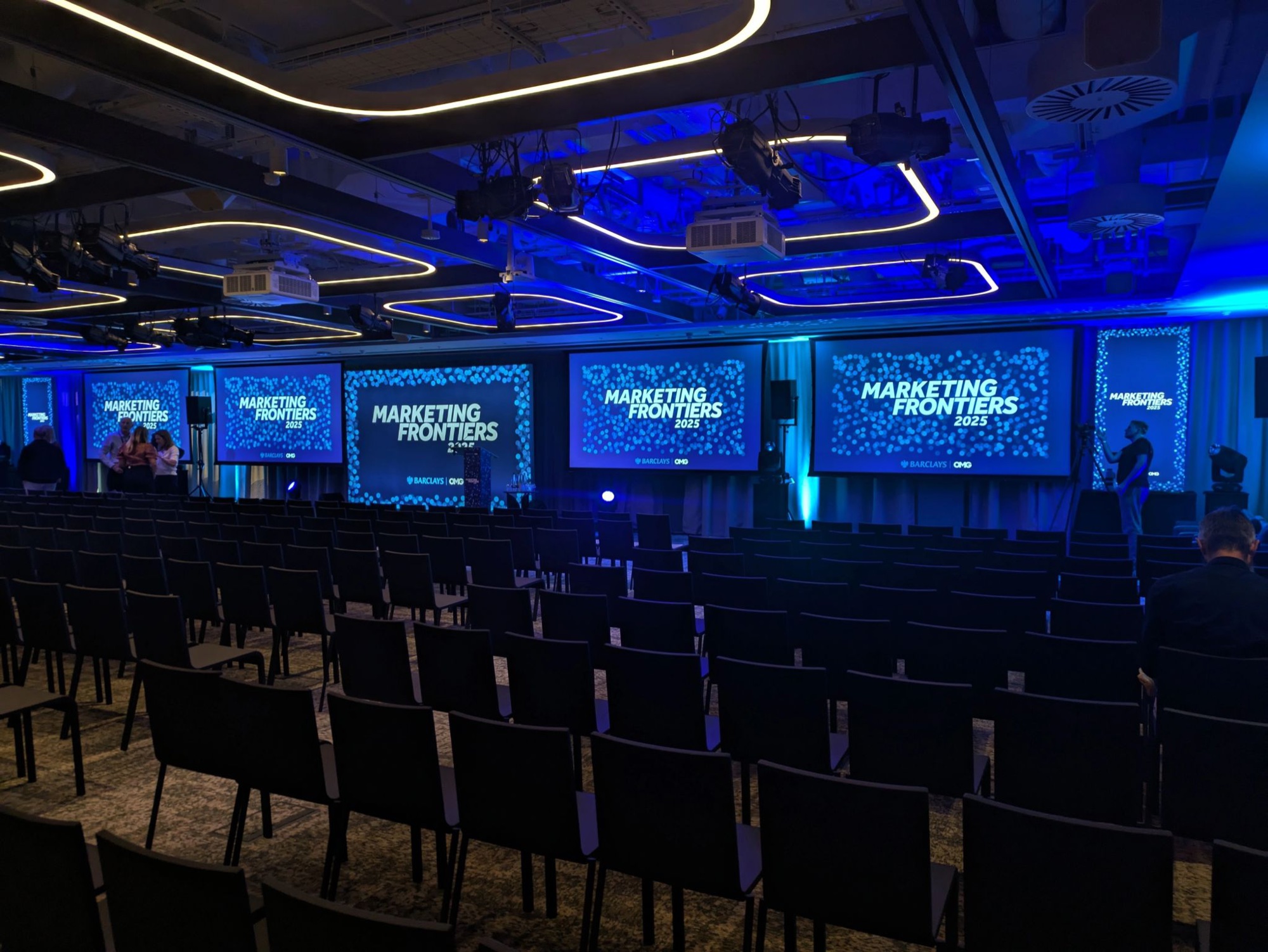
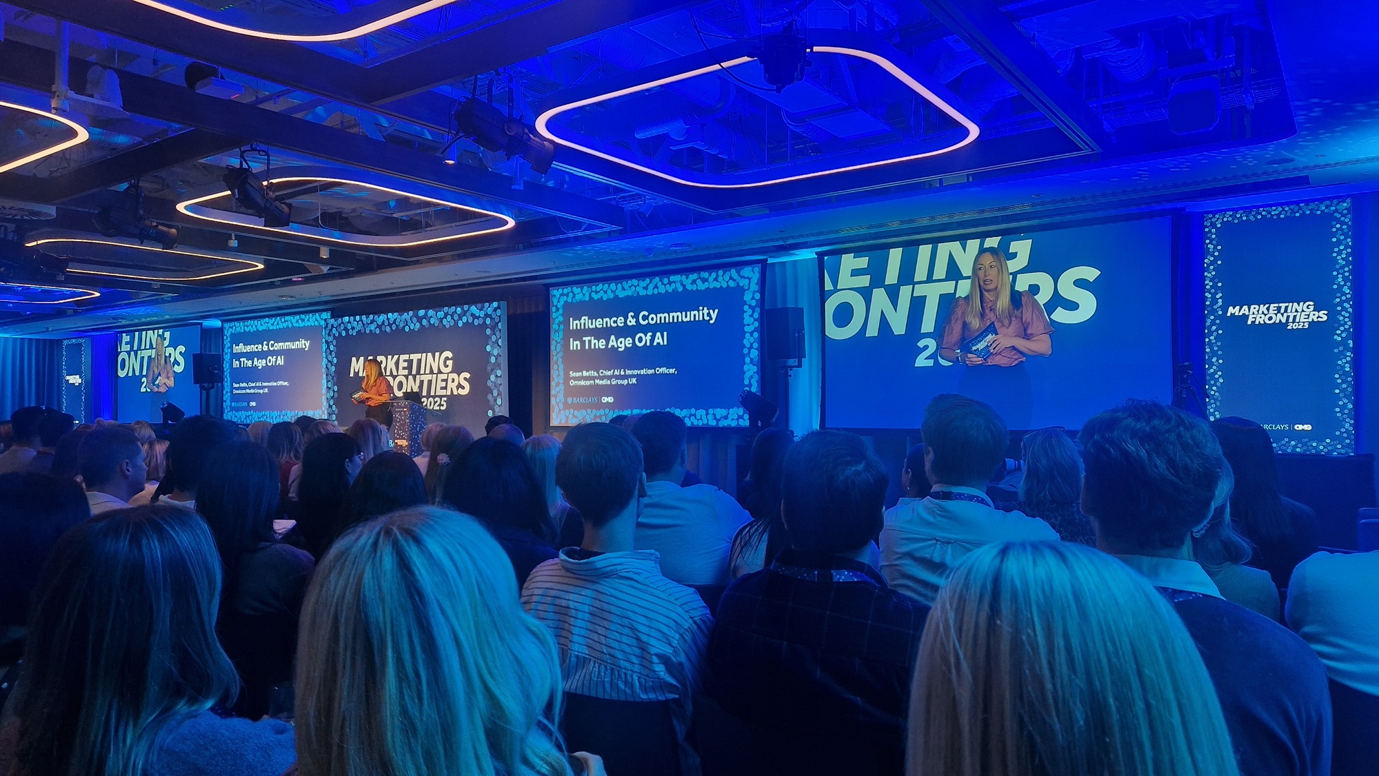
Convene is warm timber, terrazzo and soft daylight. The navy was chosen to sit against it like a piece of joinery, and each format was planned around how people move through the floor rather than where a logo would fit.
01 / 04
Entrance screens set the palette before a word is read.
Mockup — built in FigmaDesk wrap, A–M and N–Z screens, lanyards and badges.
BuiltUltra-wide screens, lectern and speaker cue cards.
BuiltThe room goes dark and the field becomes the light.
Built
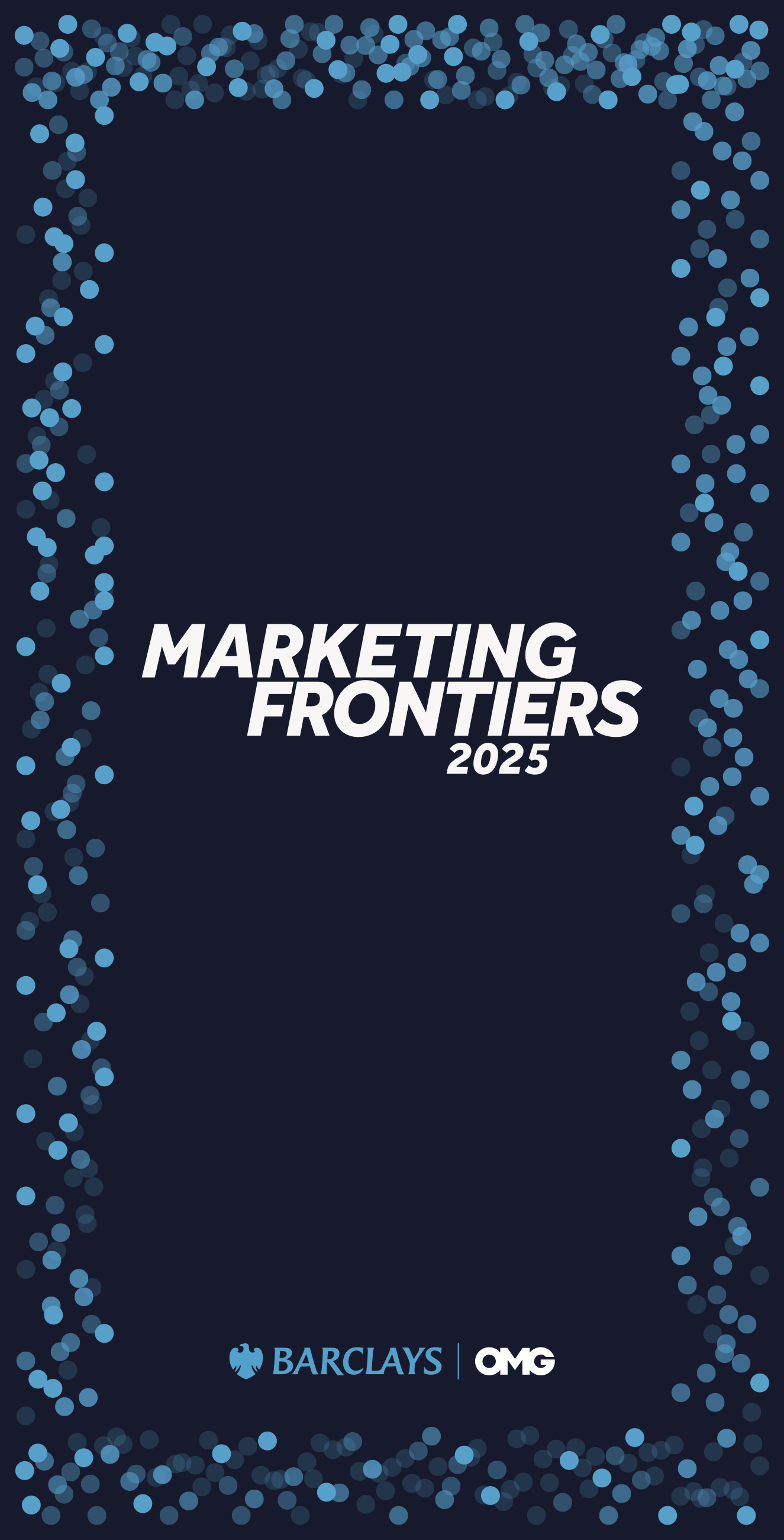


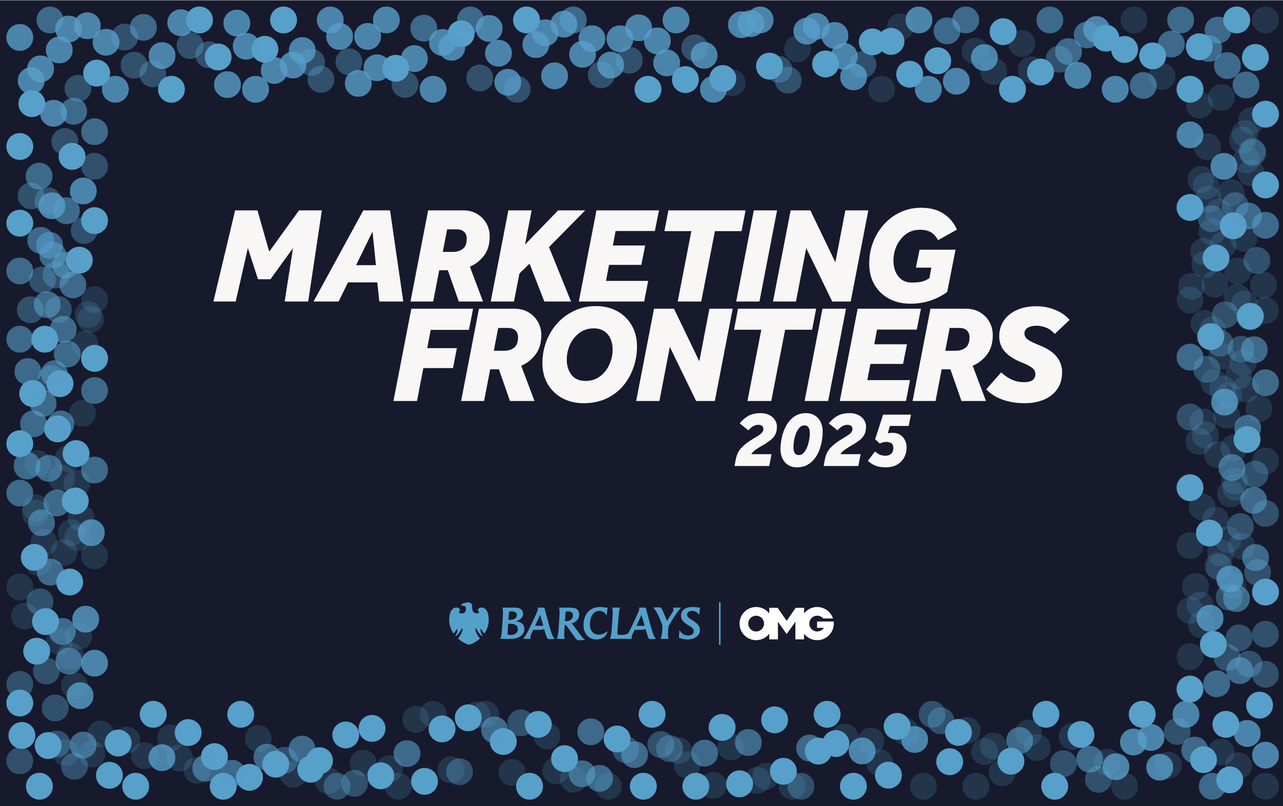

The pieces people hold get the same care as the pieces they walk past. Density scales with size, so a badge carries a handful of dots and a wall carries hundreds.
07Outcome
A brand is most convincing when you can stand inside it. The work that mattered most here was the planning of surfaces, sightlines and sequence. Two days. One venue. 500 industry professionals. So many dots.